Thursday, December 13, 2018
Tuesday, December 11, 2018
Social Media News
Pros:
- Immediate posts.
- Everyone can view it/report problems.
- Stories spread on a vast scale very fast.
- Easier to view on portable devices.
- 140 character limits preventing vast, detailed stories.
- false news.
- inaccuracy, key facts missing.
- Biased.
- Inexperienced reporters.
News Addicts- Types of readers/ people:
- Fix - addicted to news, need a 'fix'.
- Track - Accesses news regularly throughout the day to keep up to date.
- Fill - Is a commuter, uses it as a past time when traveling to work or has free time.
- Indulge - Make time to enjoy the news as a break from everything else in the day.
- Invest - Read the news regularly to get an in depth perspective on stories.
News Readers:
- Millennial: The younger generation (under 30), that get there news from twitter and social media platforms online.
- Boomers: The older generation (above 30), that traditionally watch BBC news at 6pm where the main focus is formal news on politics, weather and world issues. (Catch up).
Friday, December 7, 2018
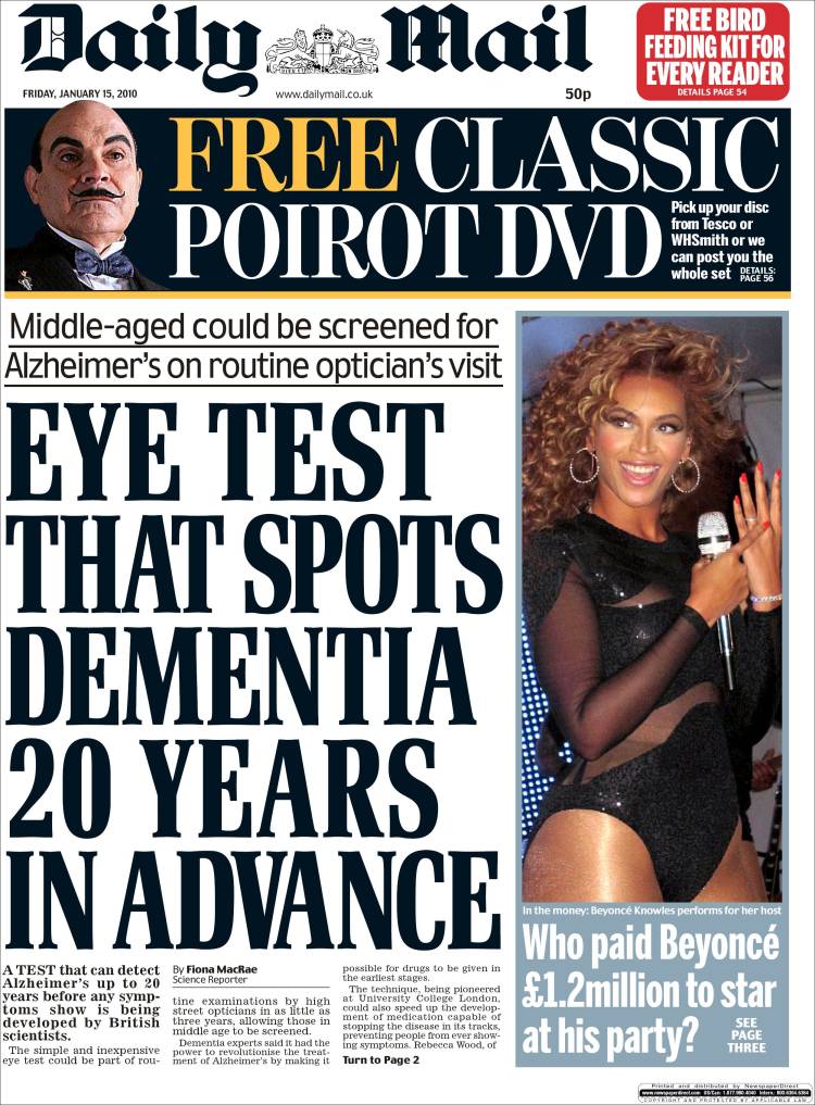
Daily Mail Mock Up
- Child obesity links to lowering IQ
- Im a celebrity
- Christmas
- health issues- caffeine addiction etc
- deep fried chicken salmonella
- std ladybirds
- nhs spending more money on addiction than child cancer treatment.
- royalty
- celebrity news
What was the task you were assigned?
As a class we were asked to create/mimic a daily mail front cover based on various titles/events that are happening in the world at the moment e.g Brexit/Celebrity news. The idea was to create a template that fits the Mail's format without it looking to much like a broadsheet or tabloid. Therefore, a balance of text, bold titles and pictures was required.
What programme did you use to complete this task?
I used publisher to create my front page, so i could add pictures and titles with a professional touch. Personally, i thought publisher was perfect for this task as it was relatively simple to create a template and adjust various aspects to create a professional looking cover. Next time if i could do this task again i would use photo shop to create an original touch to my piece of work instead of using all pictures from the internet.
What tools did you use to create your task?
I used various tools whilst creating my front cover such as cropping, editing and removing background of pictures to create a professional touch, i also added various shapes within publisher to mimic the boxes used upon the daily mail front coverings.
What were the biggest obstacles to completing the task?
Personally i believe the biggest obstacles were firstly finding the correct text to match the daily mails titles. With this i finally found a similar text that i could print screen, then edit and place onto the publisher. However the text then had to be cropped and it caused the image to be slightly fuzzy and lose quality due to the movement round various programmes rather than downloading the font. In addition the other obstacle was that during my first draft i had lots of white space present, i then had to rearrange most of the texts and enlarge the mast head.
Describe your production and why you chose the various text heading and images?
Firstly i chose the image from the home alone film due to the time preoid that we are making the newspaper in, therefore it corresponds to the potential readers. I tried to use a catchy titles to lure in the audience about the problems with child obesity, therefore if the titles is bold and gripping it is more likely that the audience will read the rest of your article. The sub-heading used was also very fact based to again show the shocking reality.
What was your initial feedback? What did others day about your production?
Firstly the images that i used were not relevant to the titles and stories therefore i removed them. The elongated picture i used had be over stretched, therefore i has to get the original image again and add it in to the publisher so i didn't ruin the cover. Then the Mast head was not aligned to the rest of the texts and titles within the front covering, so the whole texts where left aligned. After more text was needed to fill the white space.
Identify what went well and with hindsight what would you do differently?
Personally i believe my cover looks rather professional, however next time i would use a different text/font to prevent the mast head becoming fuzzy and not very detailed. If i completed this task again i would use photoshop to complete an original image to place on my front cover.

News Values
Threshold = the bigger the impact and reach of the story
Unexpectedness = an event that is out of the ordinary
Negativity = Bad news is more interesting
Elite persons = stories about important people and powerful means
Unambiguous = stories that are easy to understand
Personalisation = stories that include personal interest
Proximity = stories that are closer to home
Continuity = stories that are already in the news, continue to update
Subscribe to:
Comments (Atom)